Web design tips to increase UX
Posted on |

Web Design Tips To Increase UX
We’ve all visited a website that’s just not designed well. Difficult navigation, poor design and not being mobile optimised are all instant turn-offs for a user. 88% of online shoppers said they won’t return to a website after having a bad experience. So, what are our top tips for creating a positive user-experience?
Visualisation
The most important aspect of user-experience is the overall visual appeal of the site. Within the first 0.5 seconds of being on a site, a user has already decided whether they want to engage with the brand or not.
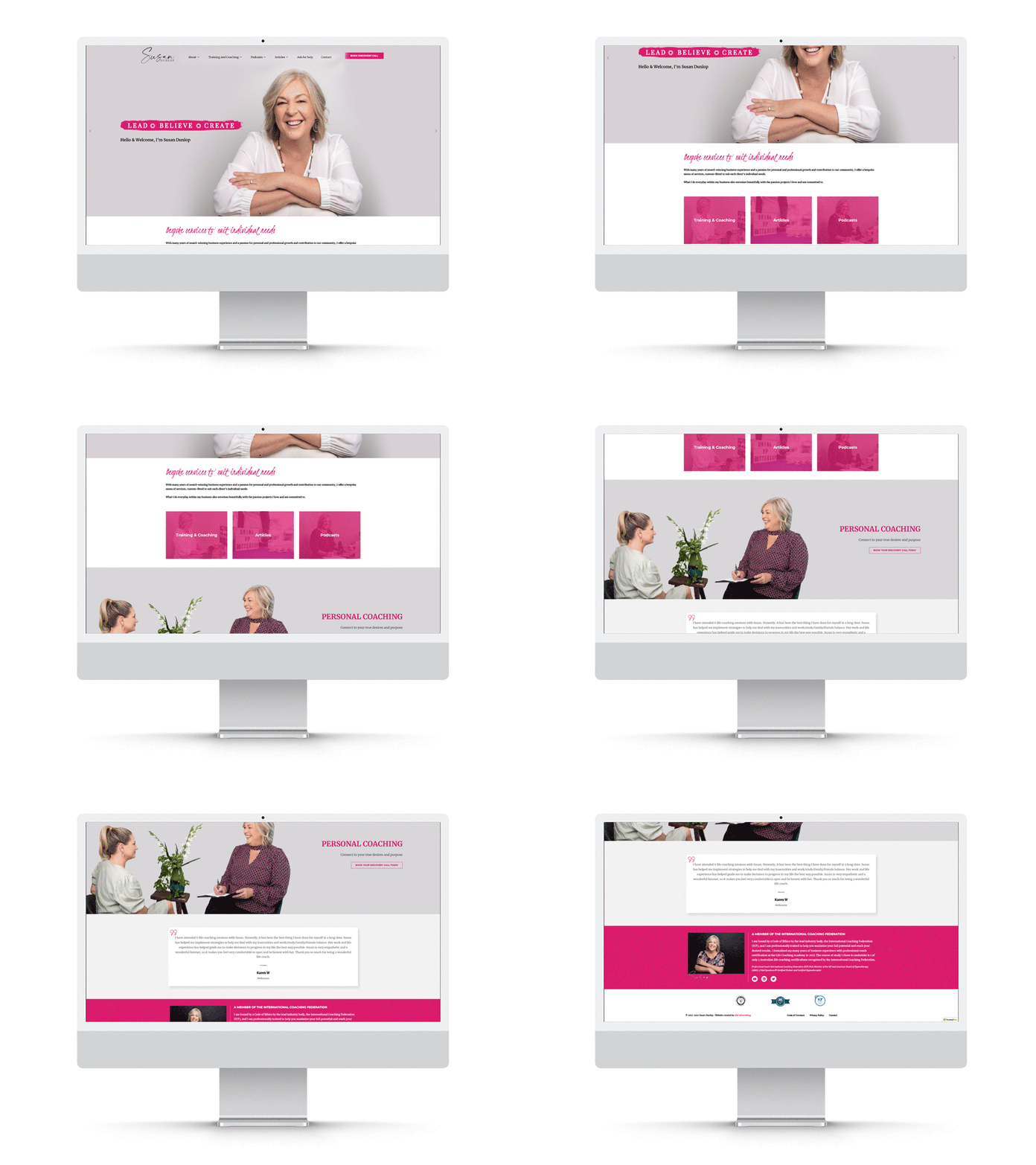
A clean, minimalistic design is useful for communicating key messages to a user, and guiding them through the navigation seamlessly. A user should never feel overwhelmed or lost on your site.
Bold colours are a key aspect of user-experience. Nobody likes a boring and bland website. Choosing justified and meaningful colours for your website will ensure users are captivated but not overwhelmed or confused. Your website should encapsulate your brand, culture and offering. Utilising white space to your advantage can assist in guiding a user’s experience, and elevating the important messaging on your site.

Feature micro-interactions
Micro-interactions are those small movements and dynamic experiences built into a website. These are important to stimulate curiosity and engagement for your users. Taking a website from static to dynamic can change the way a user views your brand image, and keep them engaged long enough to make a purchase.
There are endless ways to include micro-interactions in your website. Using triggers like scrolling, clicking, or hovering are great ways to reach your website users.
Why not try:
- Embedded videos with automatic play upon scroll
- Moving icons with hover
- Button animation with page visits
- Small pop-ups with scroll
Mobile optimisation
Around 93% of all Google searches worldwide are made from a mobile device. On top of this, over 60% of Gen Zers spend more than 3 hours per day on their phones. If mobile optimisation wasn’t a priority for your website before, think again.
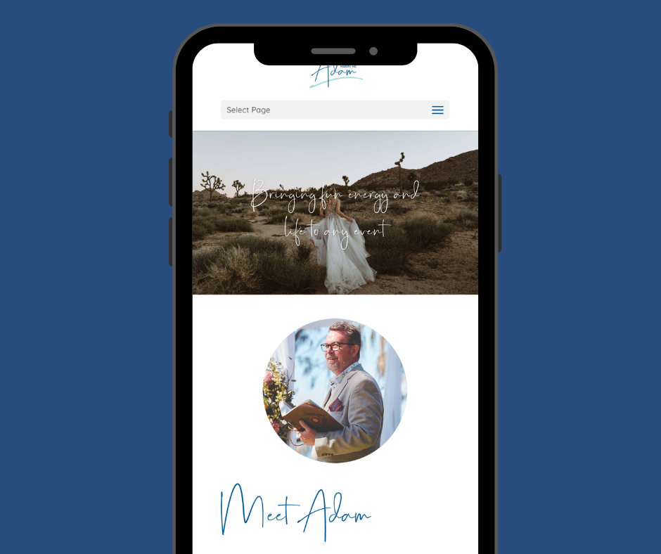
Your website content should fit clearly inside a mobile screen. Information should be neatly sorted and presented. Considerations such as font size, image size, navigation, page speed, device type and browsers are all key factors in mobile user-experience.
Brands should consider the way mobile users will interact with their website. Placing important buttons in the far corners of the screen may be inconvenient for mobile users who have to stretch their hand to reach the button. Small considerations like this can make a big difference to the user’s overall opinion of your site and brand.

User-experience elevation
Your website is your hardest working salesperson. Exploring new ways to alter and improve your website could be just what your brand needs. Remember, a user’s experience on your site can change the way they view your brand, for better or worse. These simple design tips can help to elevate your site and get you those conversions!
