Design that stops traffic!
Posted on |
Whether designing a brochure, flyer, sign, website, social media tile for your business, it helps to first ask what you are wanting this marketing to do? who do you need to talk to? what do you need to say? and importantly, what do you want them to do once they see this marketing or advertising?
Great graphic design takes your answers to these questions, and combines visual communication and problem-solving, using typography, colour, photography, videography, illustration and more, to educate, excite and engage your customers through consistent, powerful messages that sell the value of your business.
By blending carefully chosen images, impactful headlines, messages that promote the benefits of your business, and a presentation which promotes your strategic thinking, provides the opportunity to cut through the clutter of marketing and advertising messages to stop people in their tracks, whether their reading a magazine, browsing the internet or driving down a busy road. That is the power of great design.
Here are some graphic design tips, to help you better present and promote your ideas and messages to engage your customers:
1. Know your brand
Start by clearly defining your brand identity and values, what you stand for and what benefits or value you deliver to your customers. This will guide your graphic design choices and ensure consistency across all visual elements of your marketing communications.
2. Understand your target audiences
Who they are, where they live, what they like, and the messages you want to convey to them through your designs.
3. Keep it simple
Avoid cluttered or complex design that can confuse or overwhelm your audiences. Makes every word count. Focus on clean layouts, clear messaging and a minimal colour palette to create strong visual appeal that is bold, bright and stands out from the crowd.
4. Consistent branding
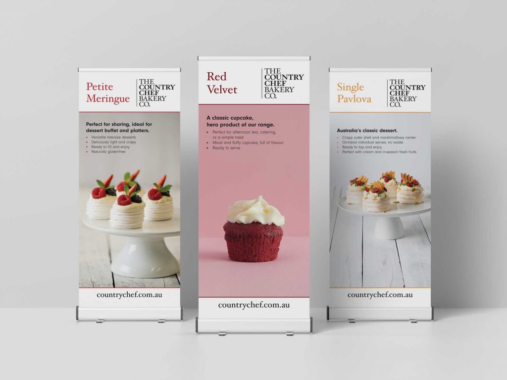
Create stronger awareness by establishing a consistent visual language or style guide, through the colour, fonts and imagery you use, and apply it consistently across all your design and communication materials, including your logo, website, social media graphics and marketing collateral.
5. Use high-quality photography and videography
Quality images and visuals present a strong, credible, professional presentation of your business. If budget permits, source a professional photographer or videographer. If not, authentic images and videos can be captured through your phone if you’ve got the skills to edit. Try not to use stock images too much, as you want to stand out and be unique.
6. Typography matters
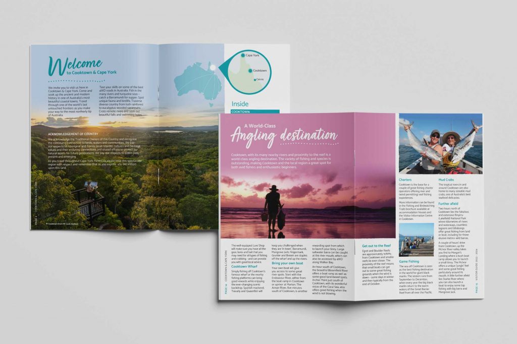
Choose fonts that reflect your brand personality and legible across print, digital, signage and all devices, especially mobiles. Use font pairings, for headlines and body copy, that work well together and consider typography hierarchy to guide the viewer’s eye.
7. Visual hierarchy
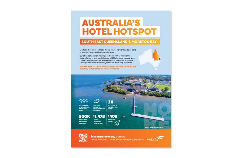
To help guide the viewer’s attention use contract, size, colour, placement and space to promote the key elements or messages and create a clear flow of information which stands out and is easy for the viewer to digest.
8. White space
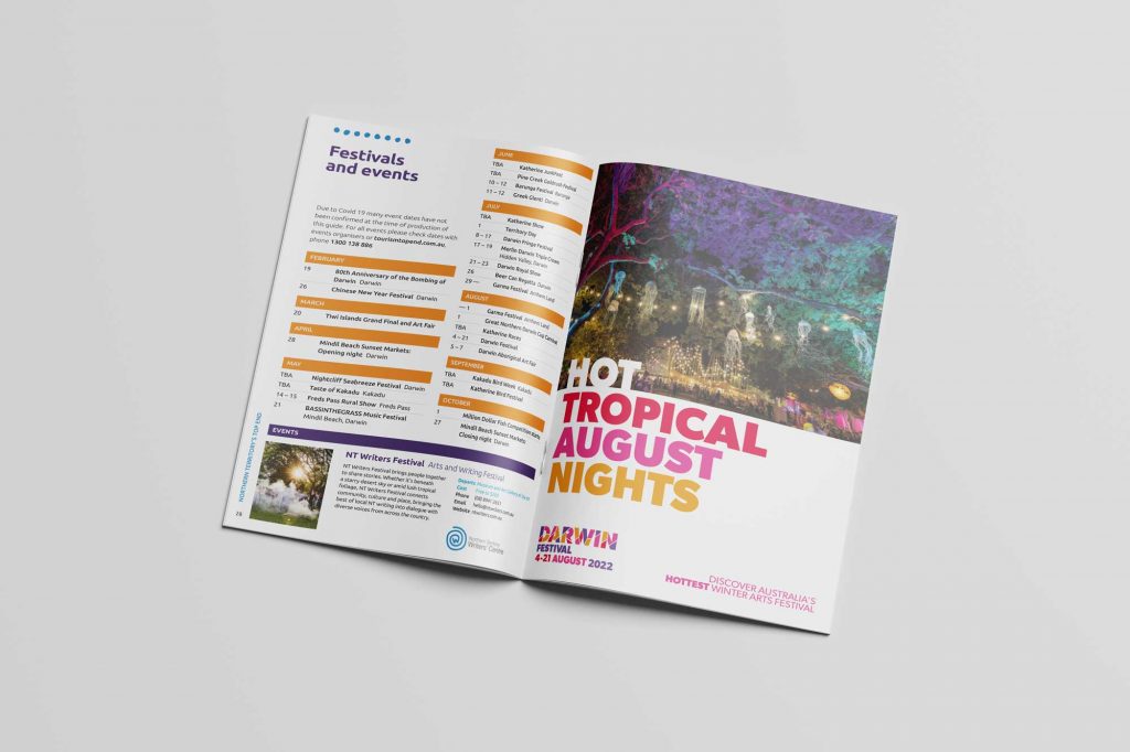
Embrace white space or negative space in your designs to help create balance, focus and clarity, which allows your design to breathe and makes important messages to stand out.
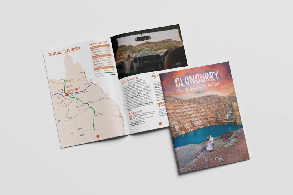
9. Create infographics
Which are an effective way to present complex information in a visually appealing and easily digestible format. Use charts, graphs, icons and illustrations to simplify data and tell your story.
10. Consistency across all platforms
Adapt and optimise your designs for different platforms and formats for social media, websites, print materials and other marketing mediums.
11. Use design tools
Software like Adobe Creative Suite, Canva or Figma can help you create professional looking designs. These tools offer pre-designed templates, easy-to-use interfaces, and a wide range of design assets to streamline the design process.
12. Test and review
Don’t be afraid to test different design variations and gather feedback for your friends, colleagues or target customers. A/B testing can help you understand what design elements and layouts resonate best with your target audiences. Use these insights to refine your designs and improve their effectiveness.
Remember, effective graphic design should align with your brand, communicate your message clearly, and resonate with your target audience. Invest in professional design resources when necessary, and continuously seek inspiration and stay updated with design trends to ensure your designs remain fresh and impactful.
If you need help developing your brand style guide, designing your website, social media graphics, brochures, signage or any other marketing collateral we’d love to meet with you over a coffee to discuss what would best work for you.
Let’s get down to business!

Leave a Reply